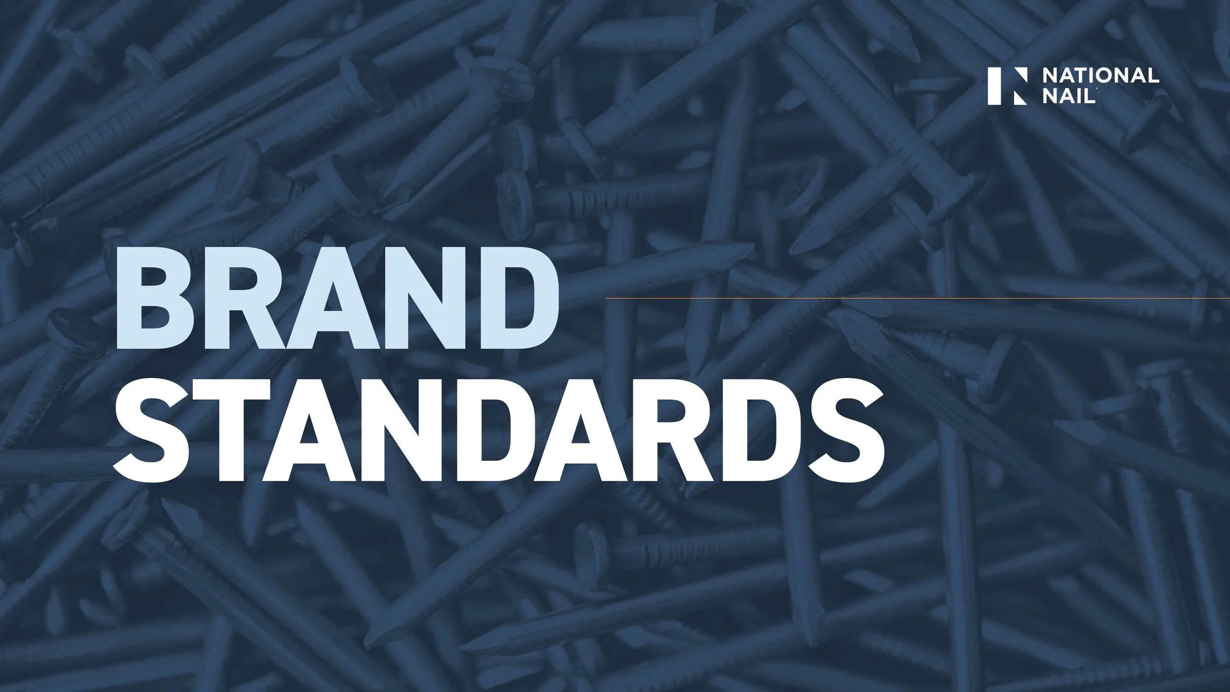
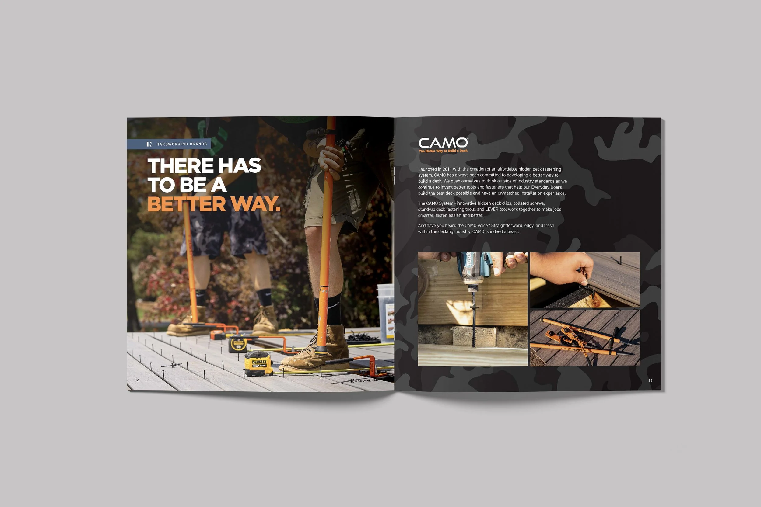
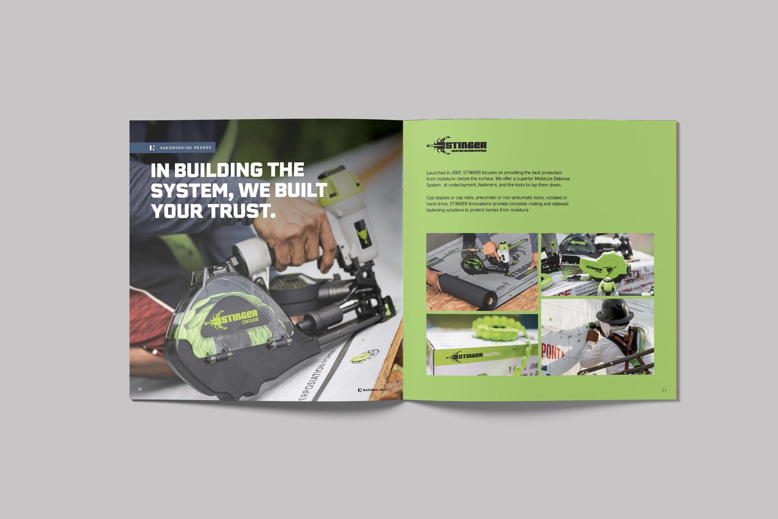
National Nail Corporate Branding
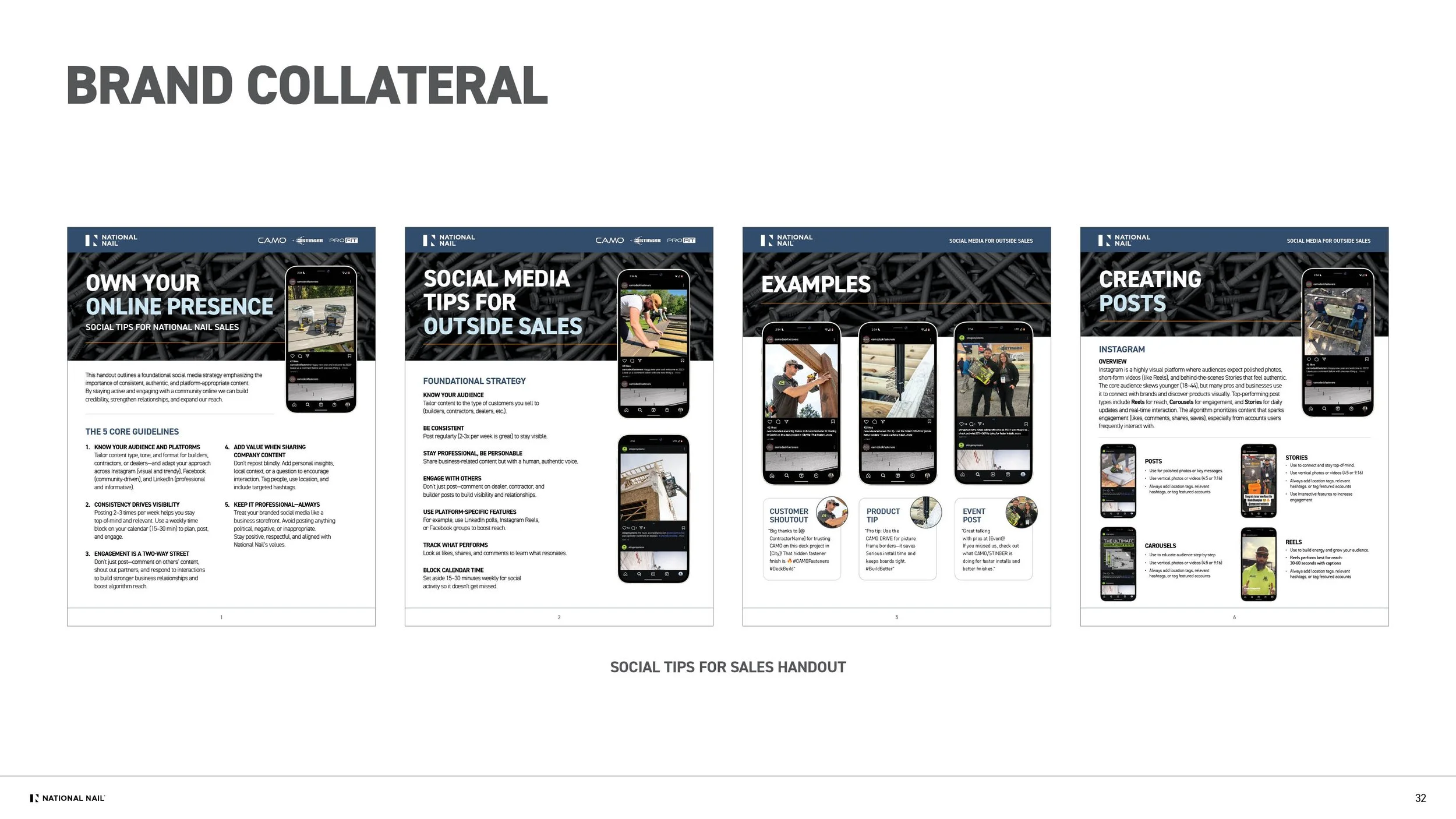
National Nail is a West Michigan–based fastener company overseeing three major brands in the building materials industry—CAMO, STINGER, and PRO-FIT. While each product brand had a strong, individual identity, the corporate brand had not evolved alongside them. I helped champion and design the new corporate identity, shaping standards that now guide several websites, a brand book, trade-show branding, and all internal materials.


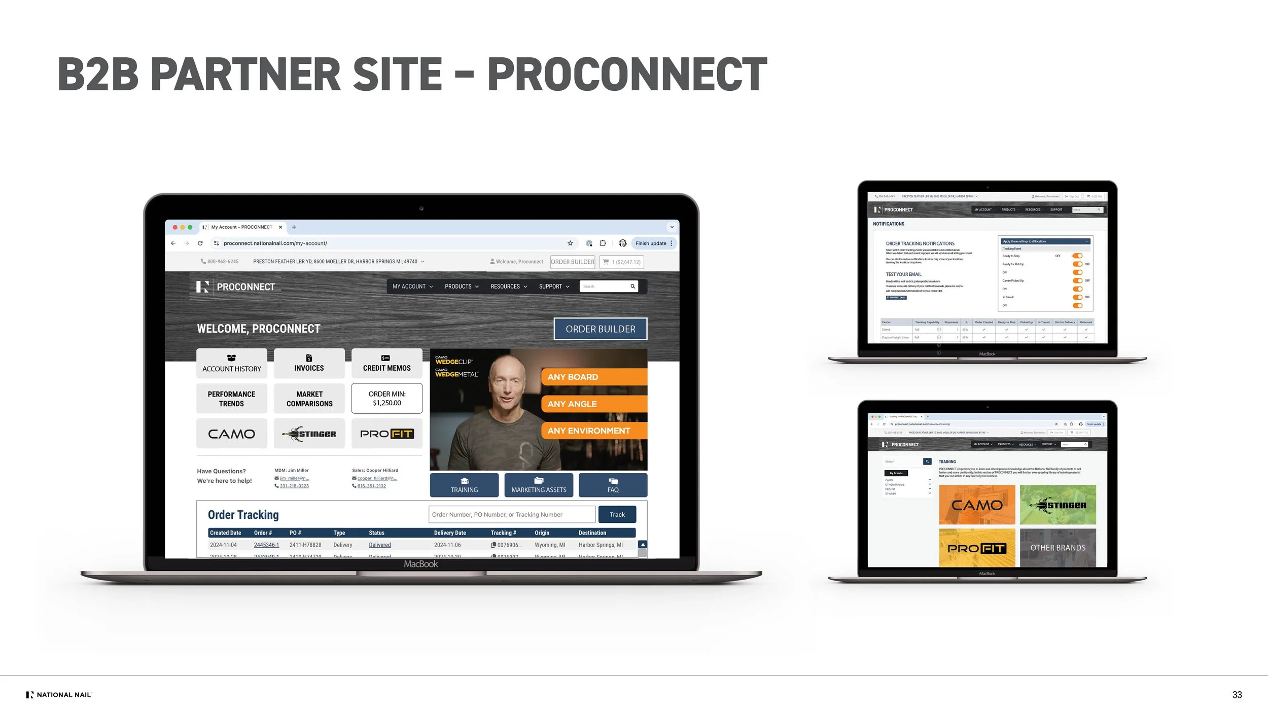
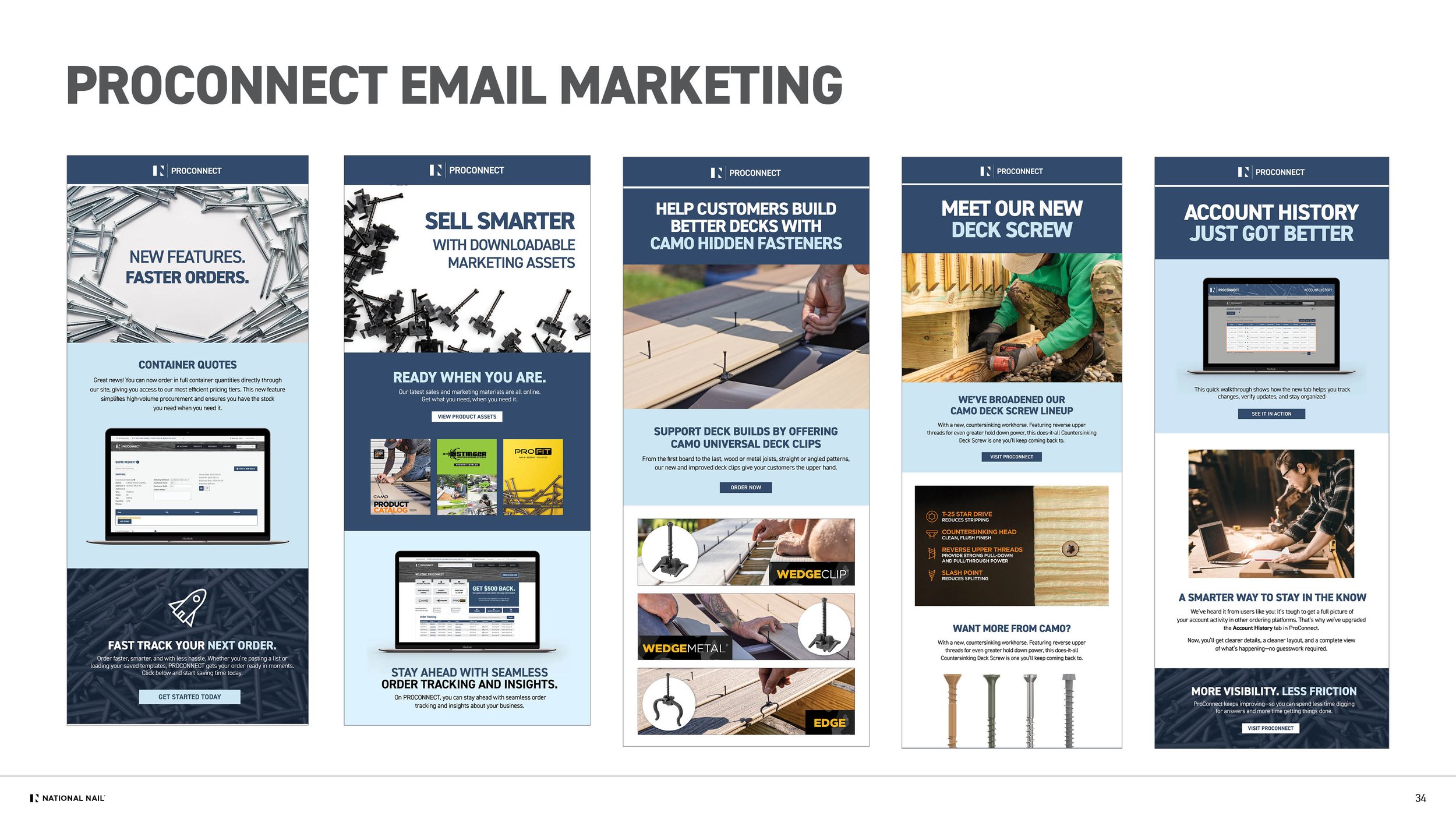
As the corporate identity evolved, I guided several creative initiatives that brought the new system to life—most notably the ProConnect B2B platform. I partnered across departments to ensure consistency throughout the site, which generated $5M in its first year. I also shaped the ProConnect launch campaign from initial concept through execution, aligning stakeholders around a cohesive visual and strategic direction.


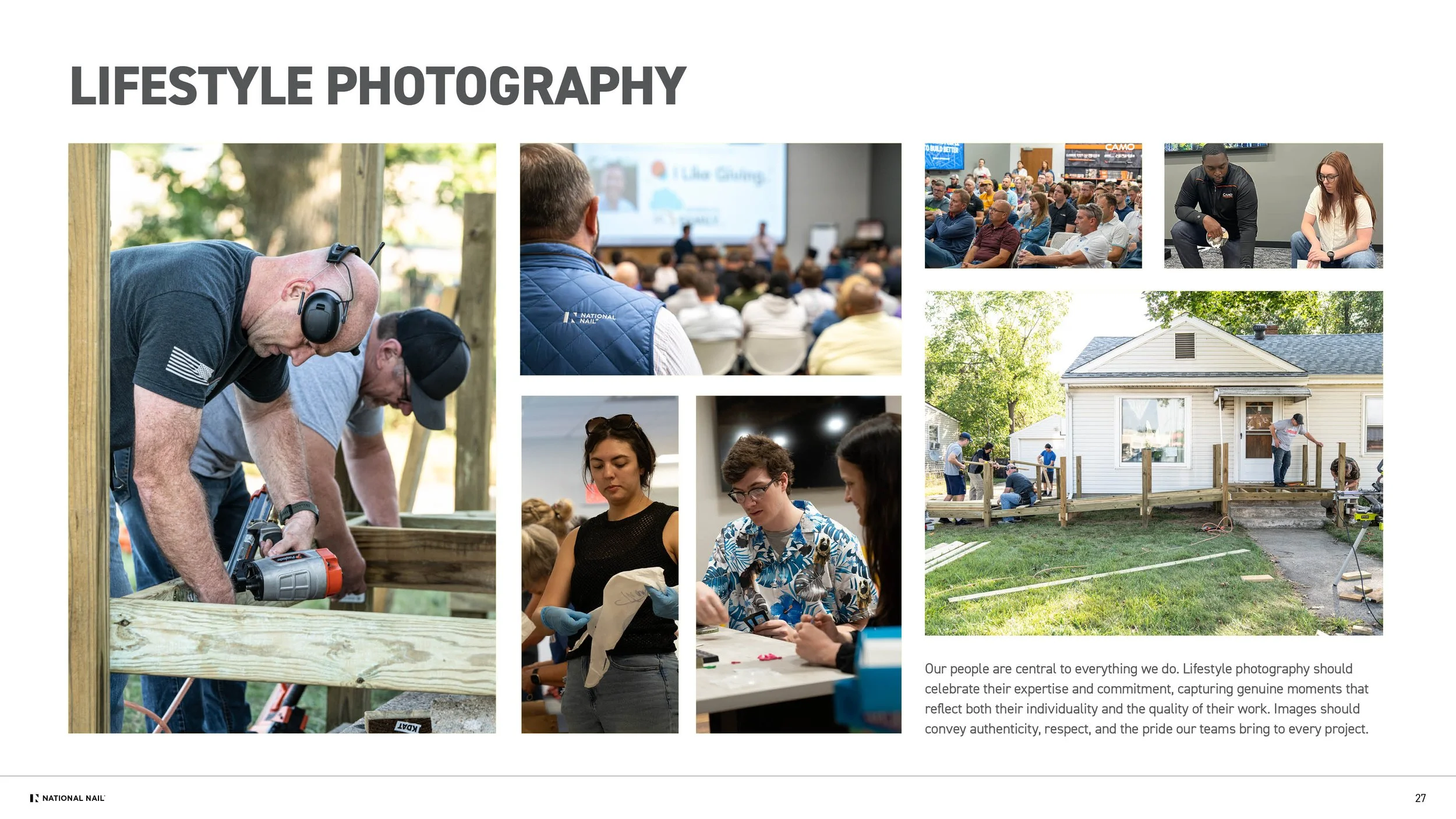
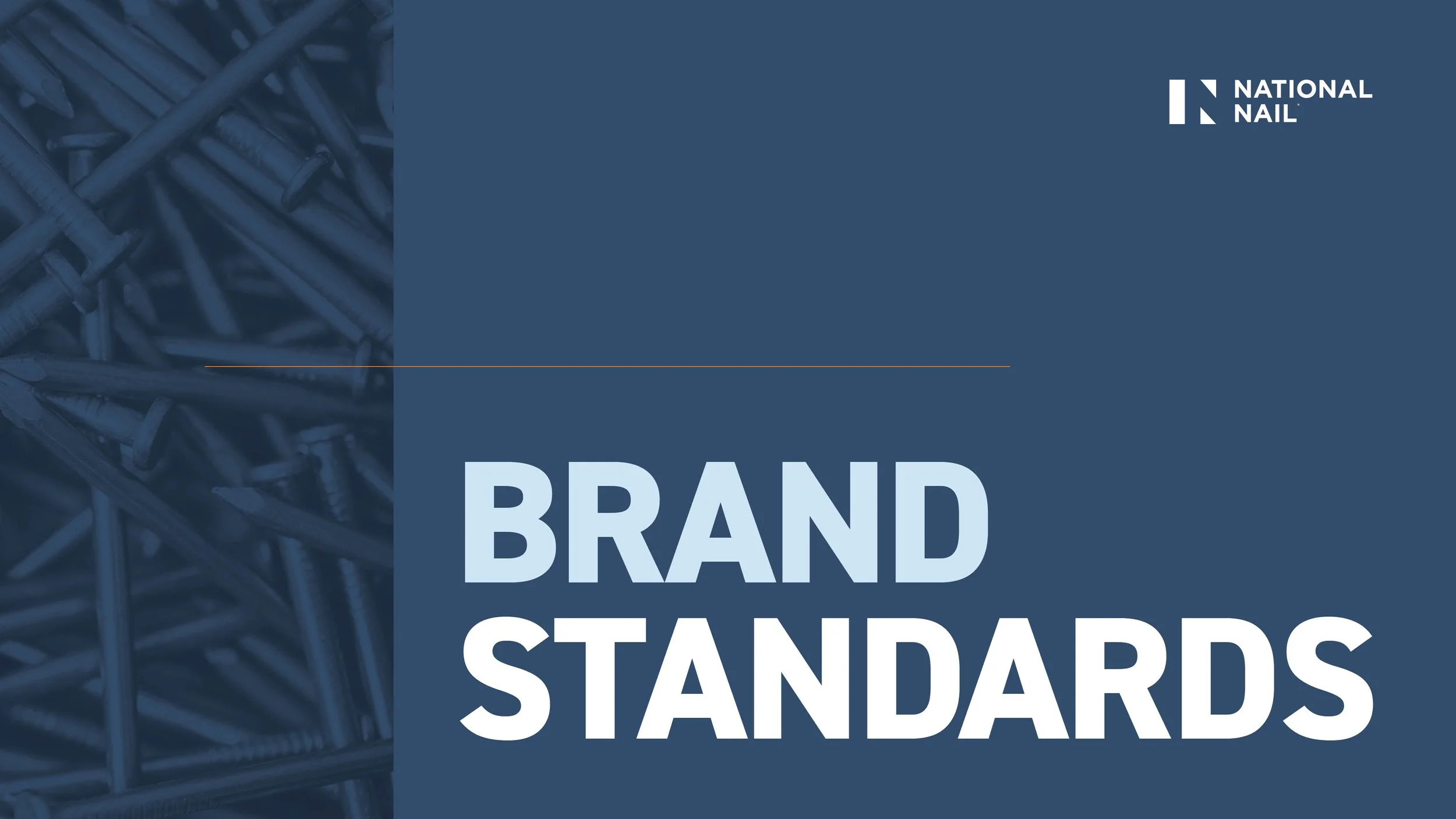
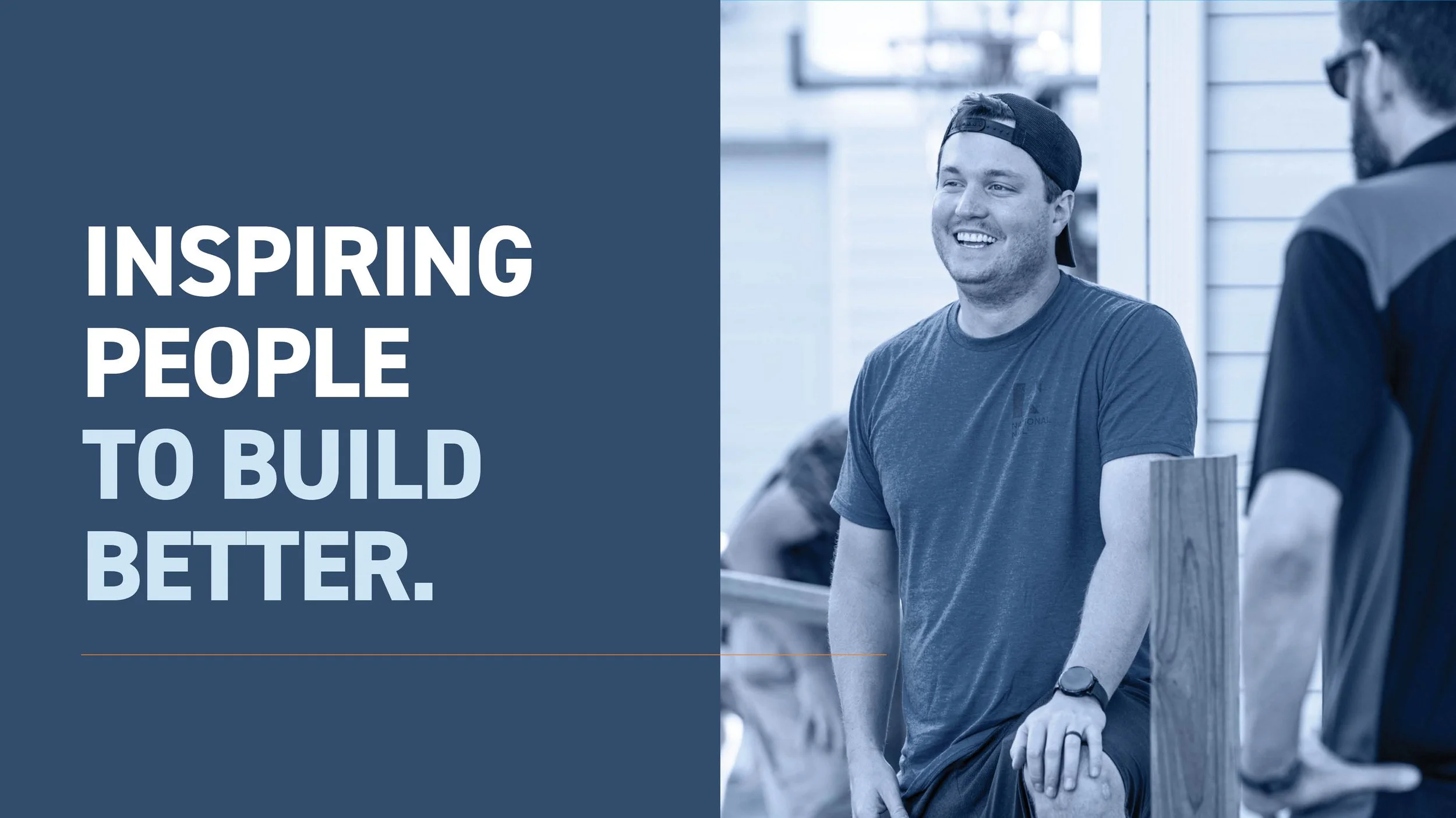
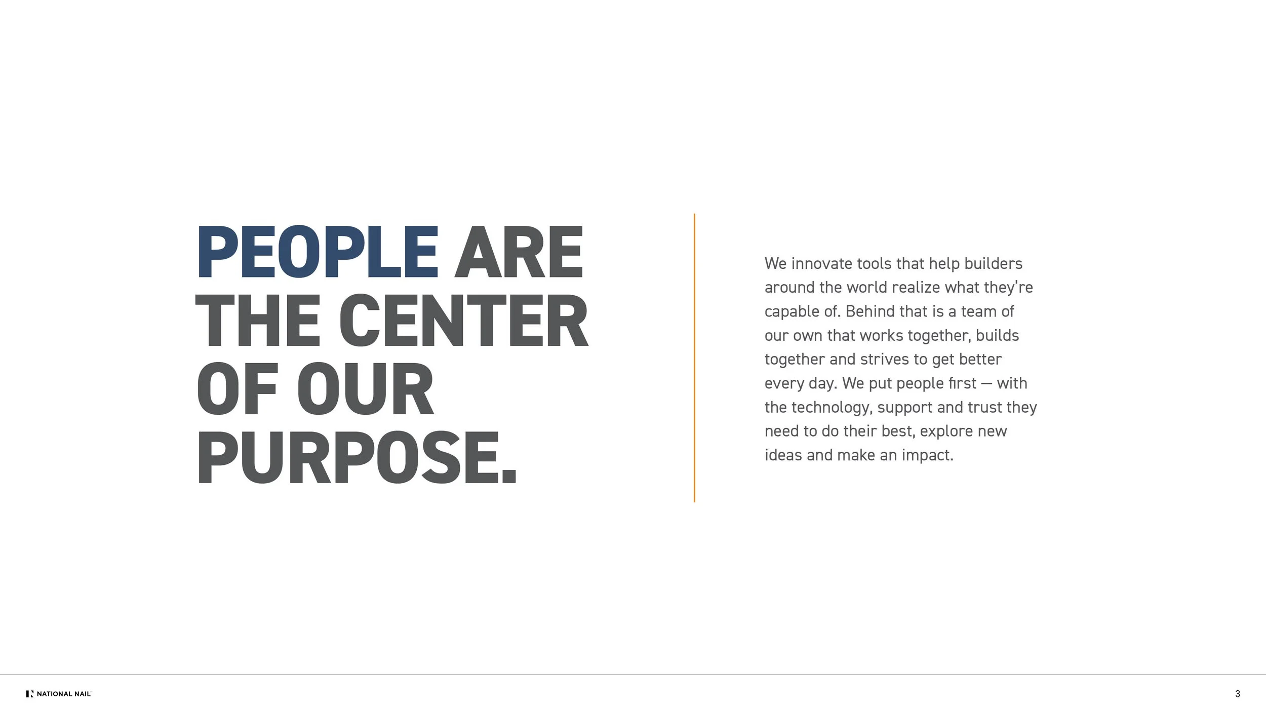
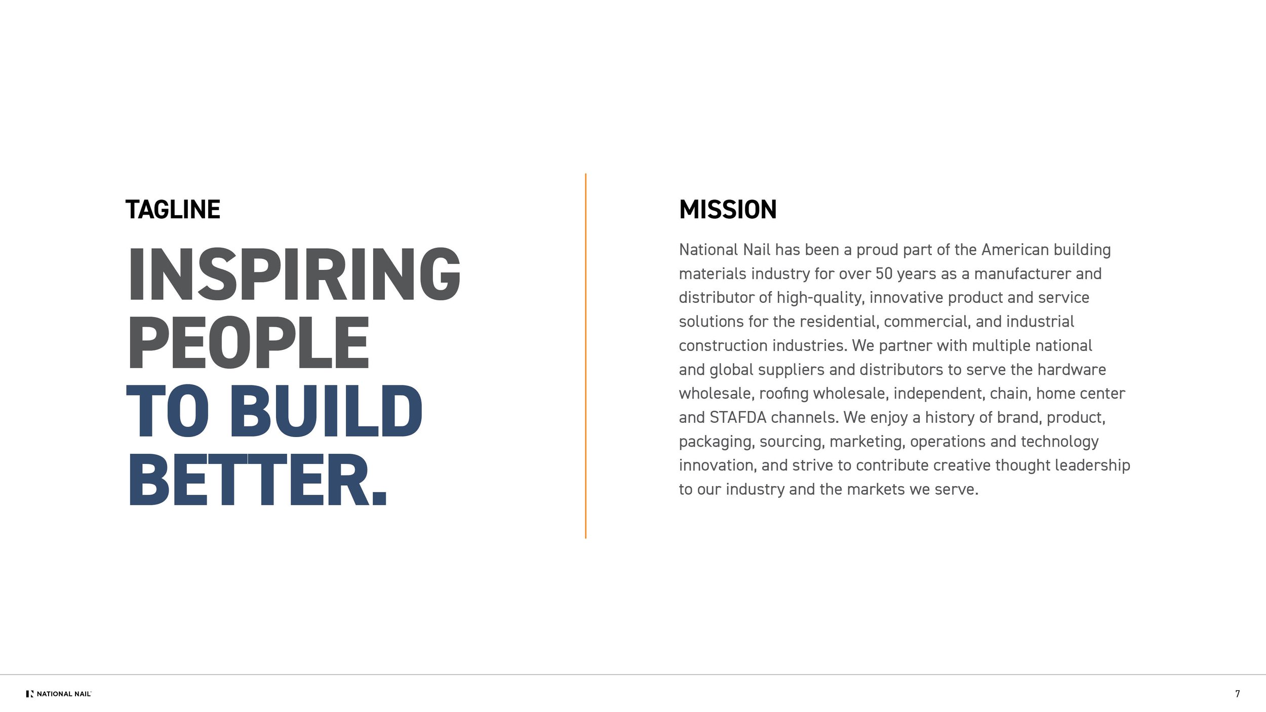
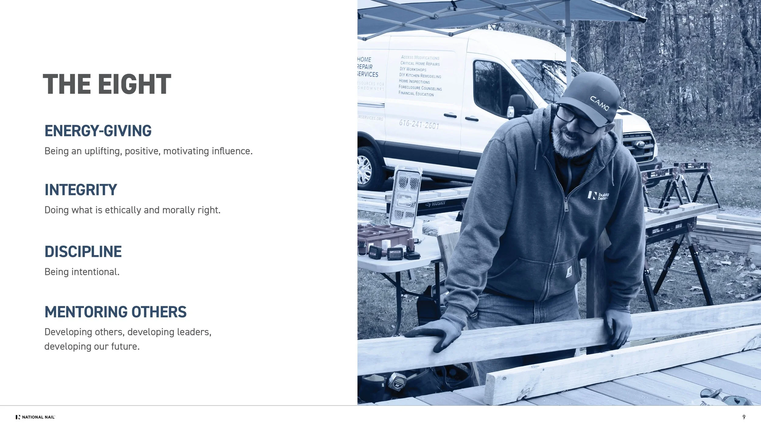
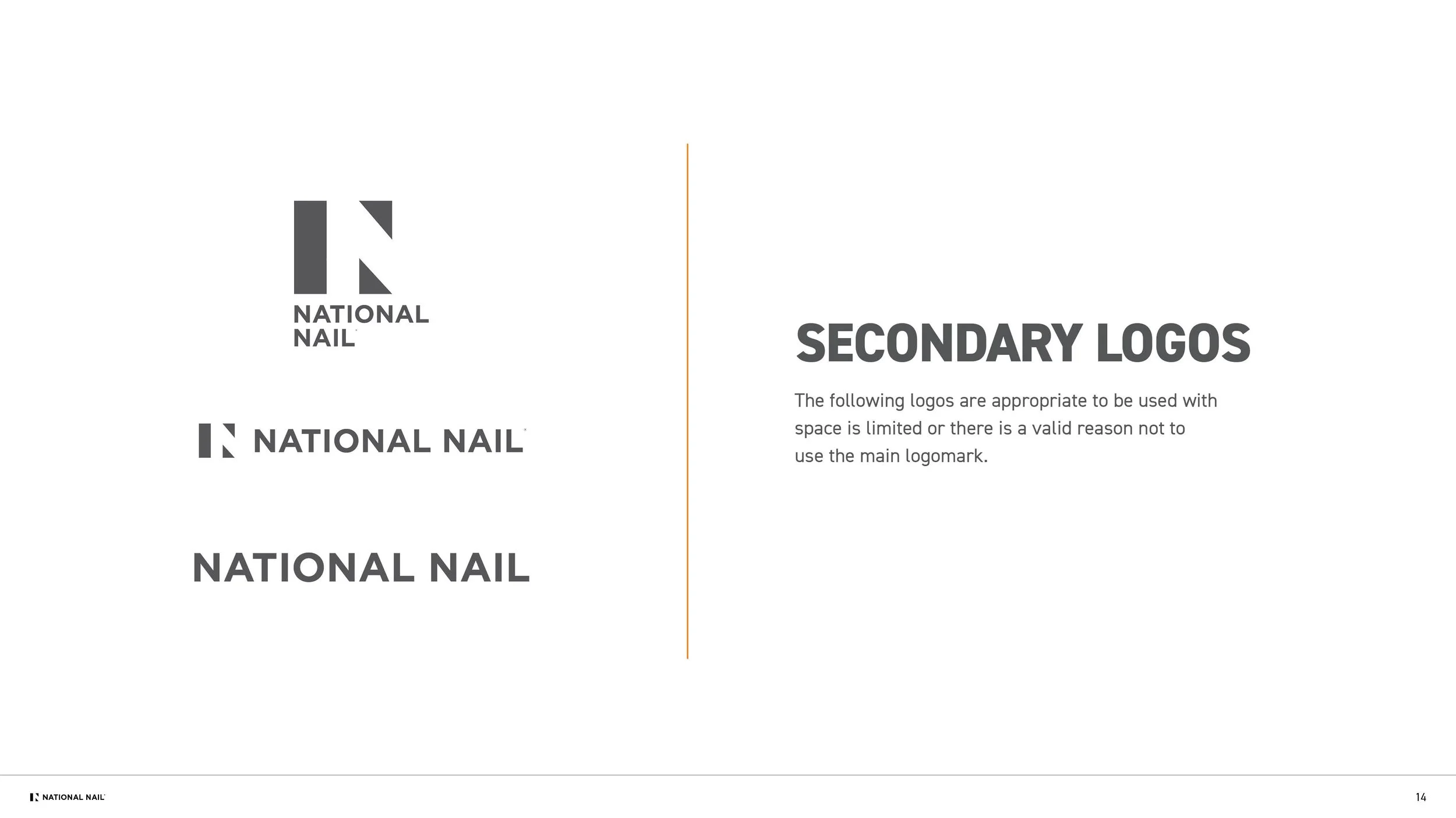
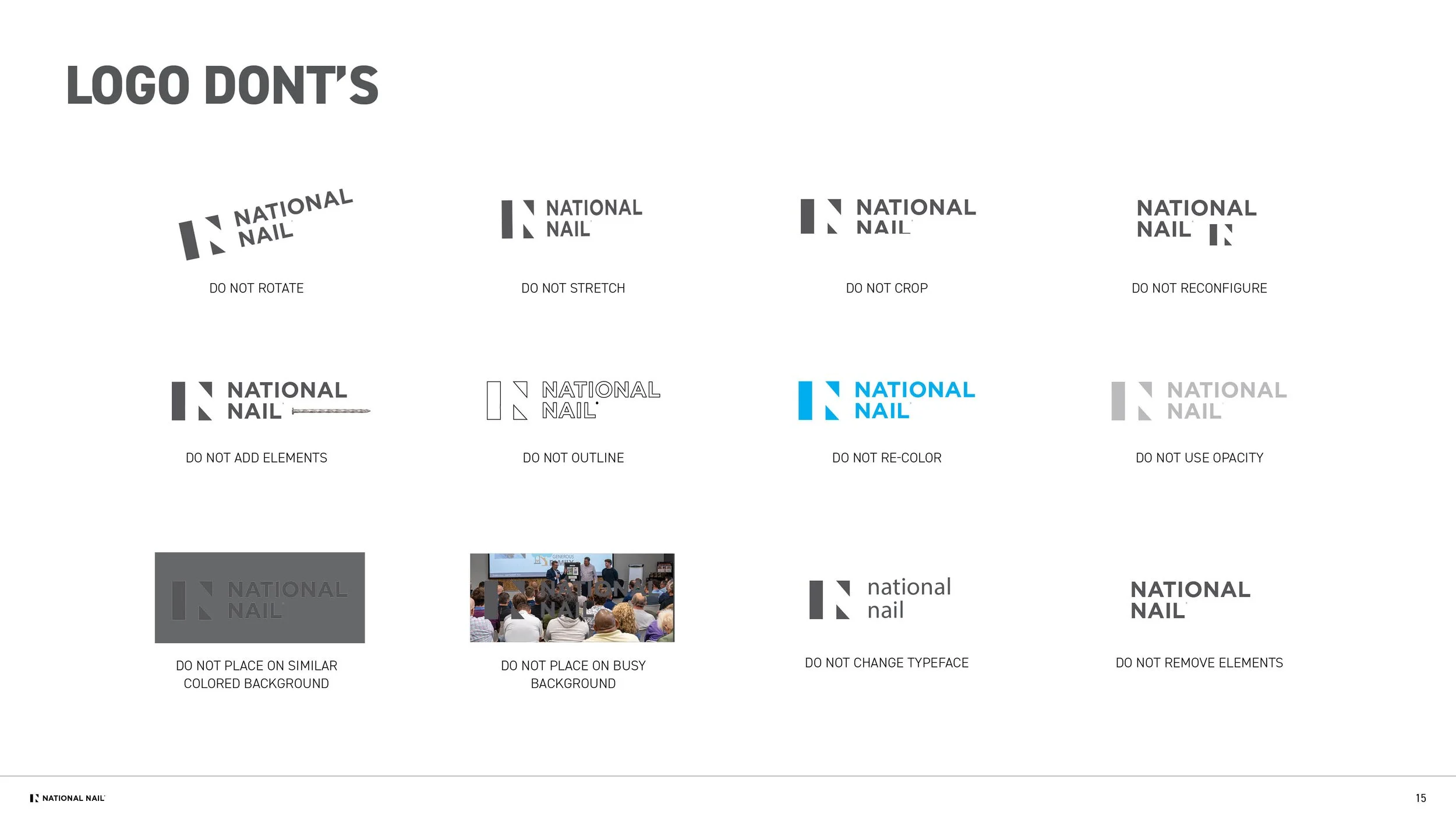
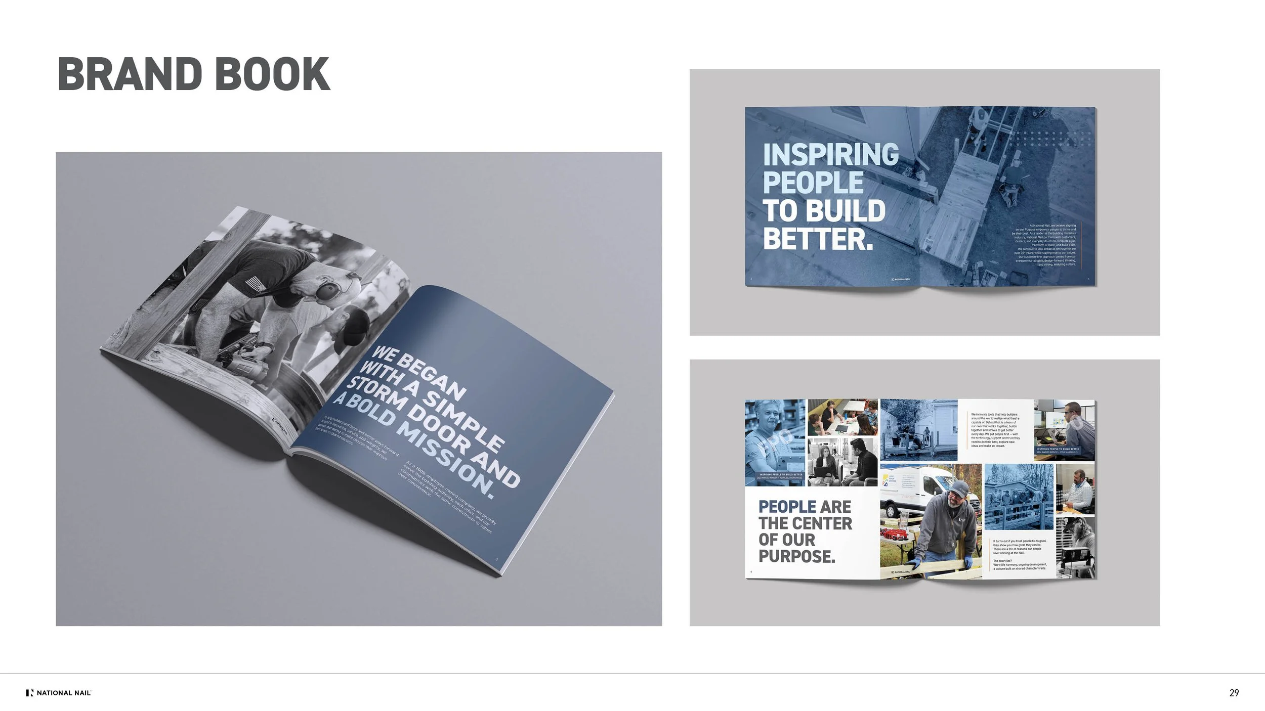
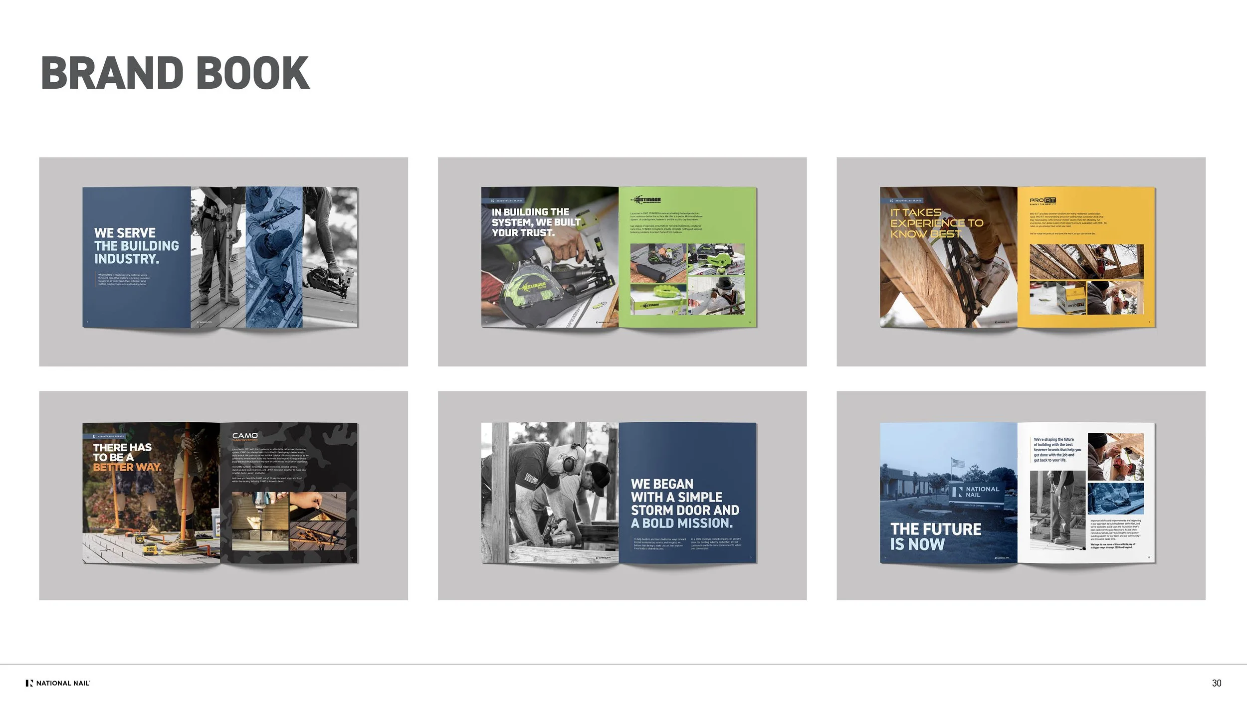
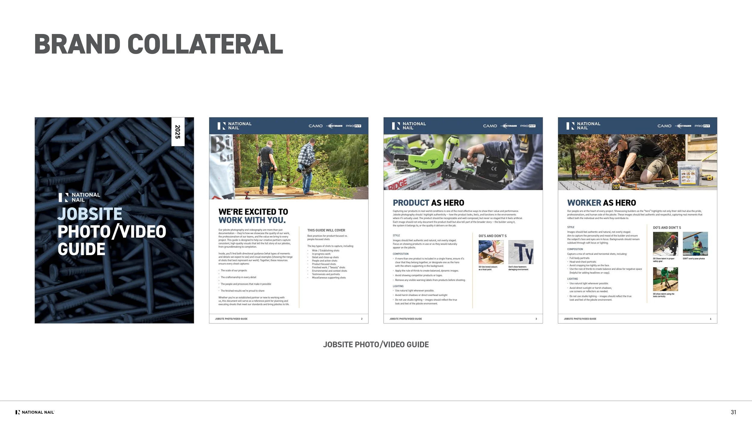
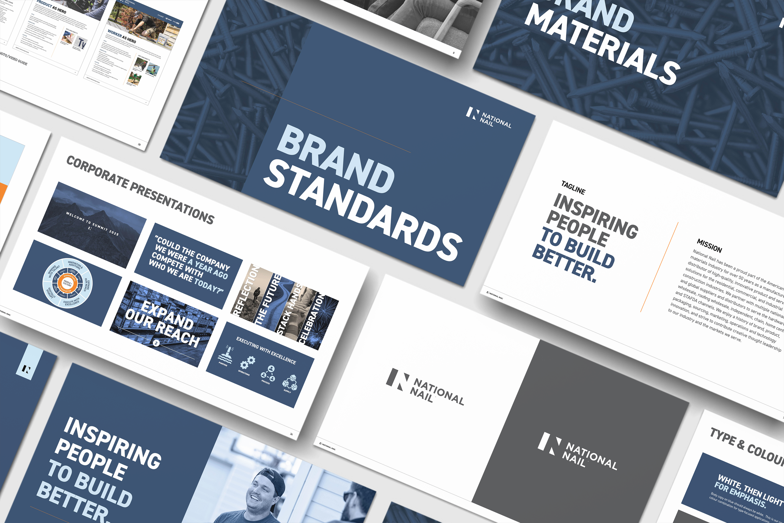
The corporate brand book became the centerpiece of the refreshed identity: a place to articulate our purpose, core pillars, and how the three product brands relate within the larger ecosystem. Our team shaped its visual and narrative direction, creating a piece that now serves as a foundational introduction for both internal teams and external partners.
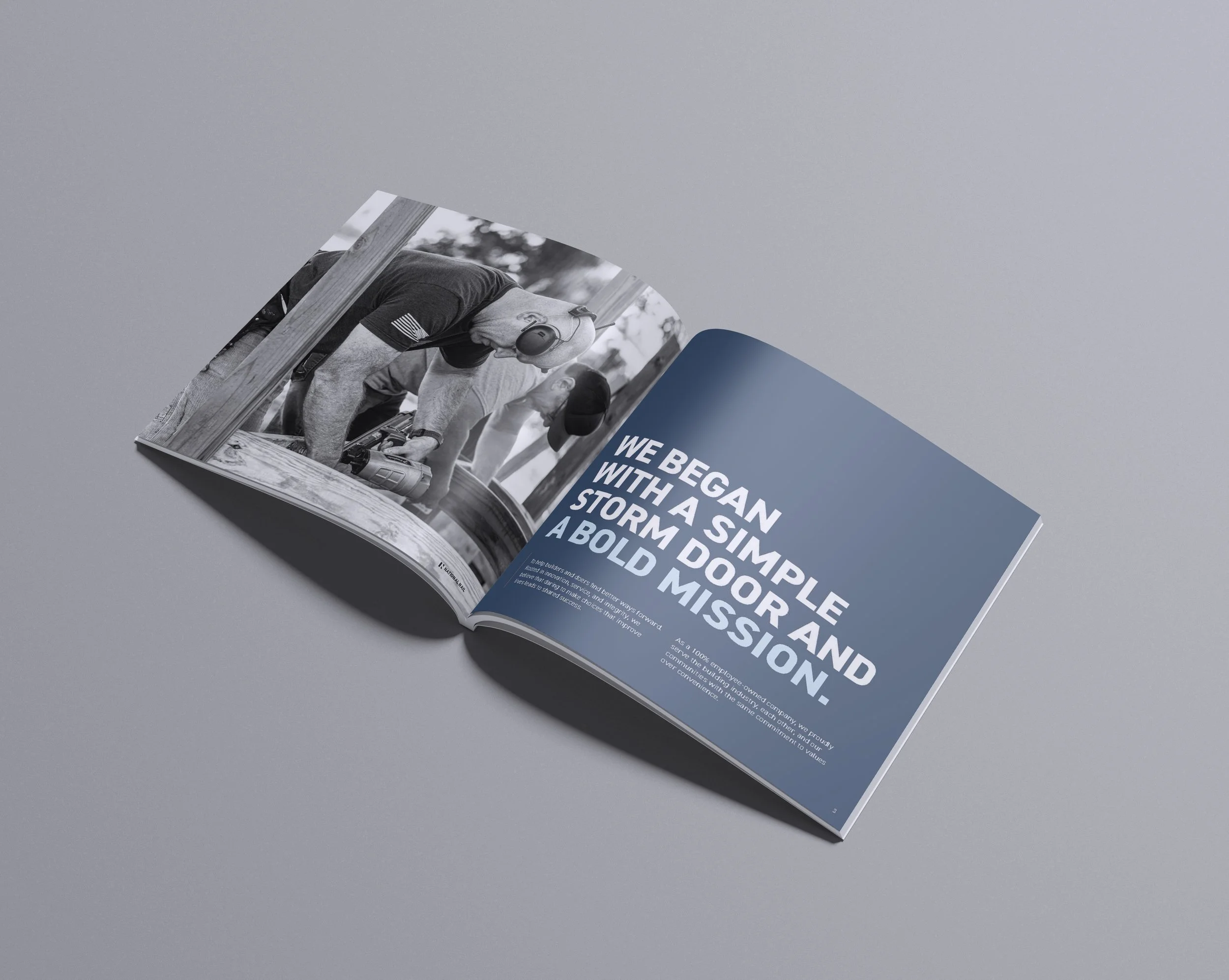

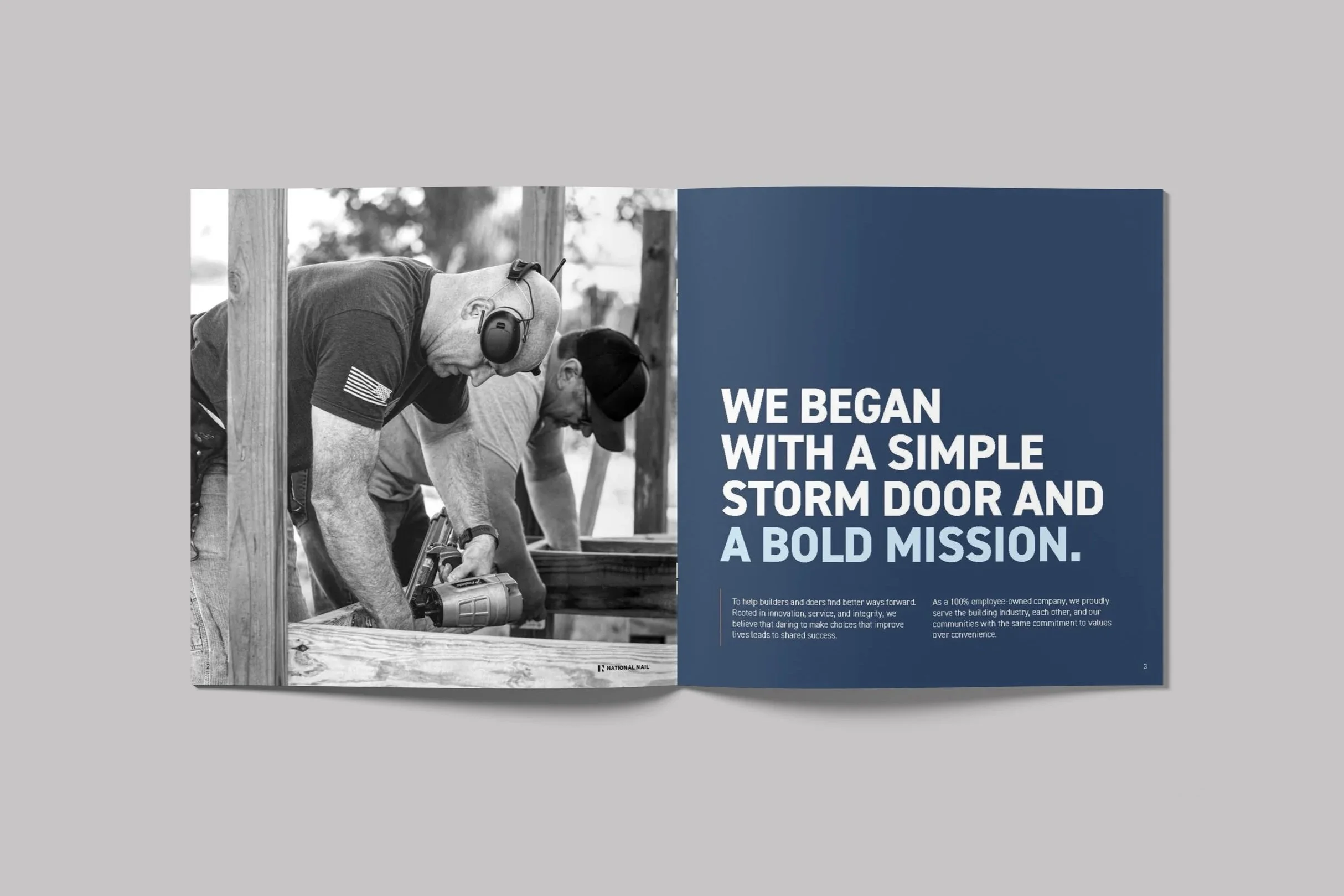

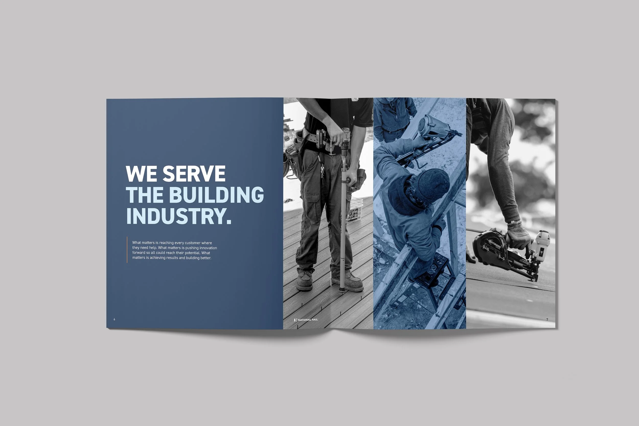


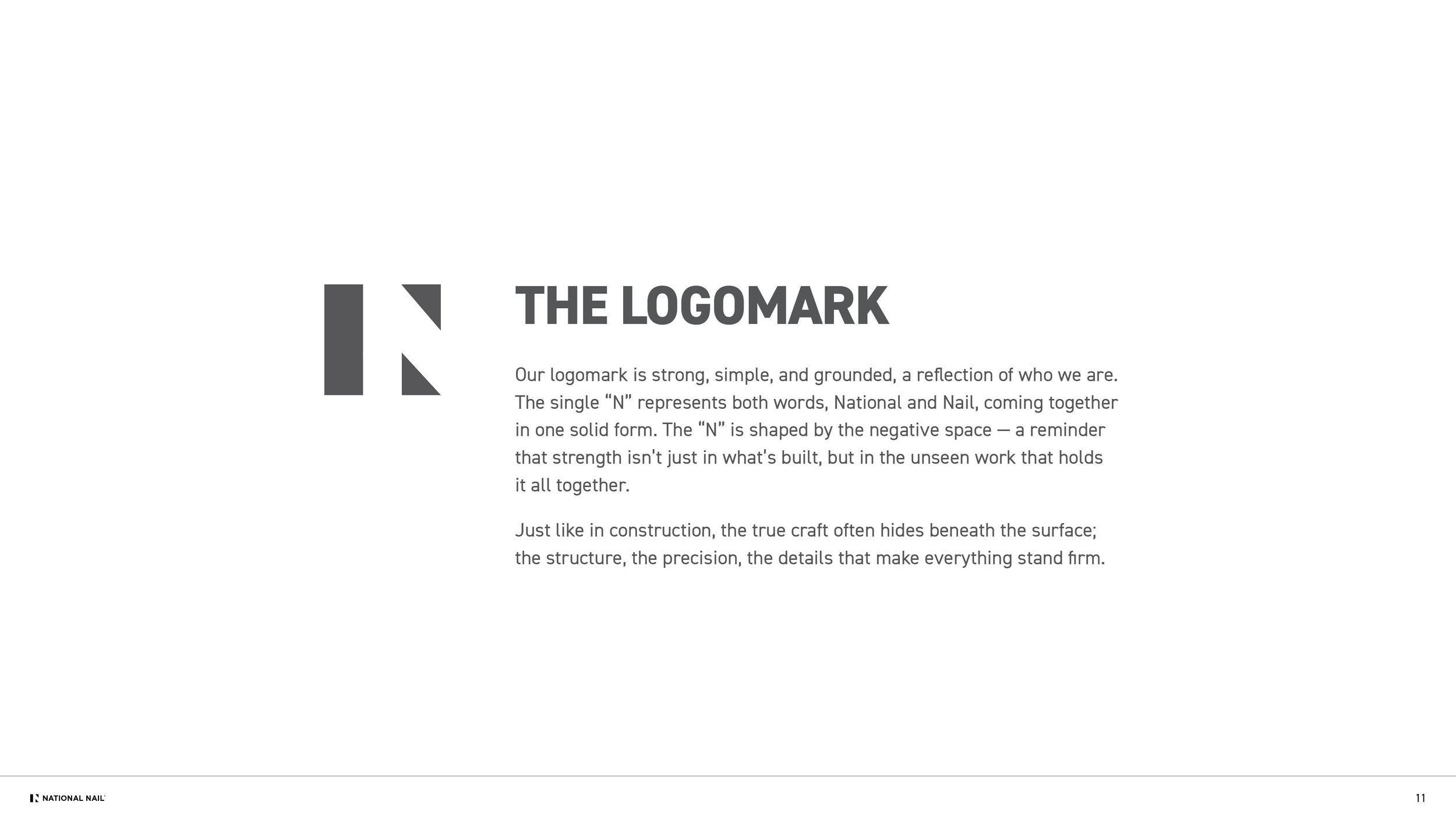
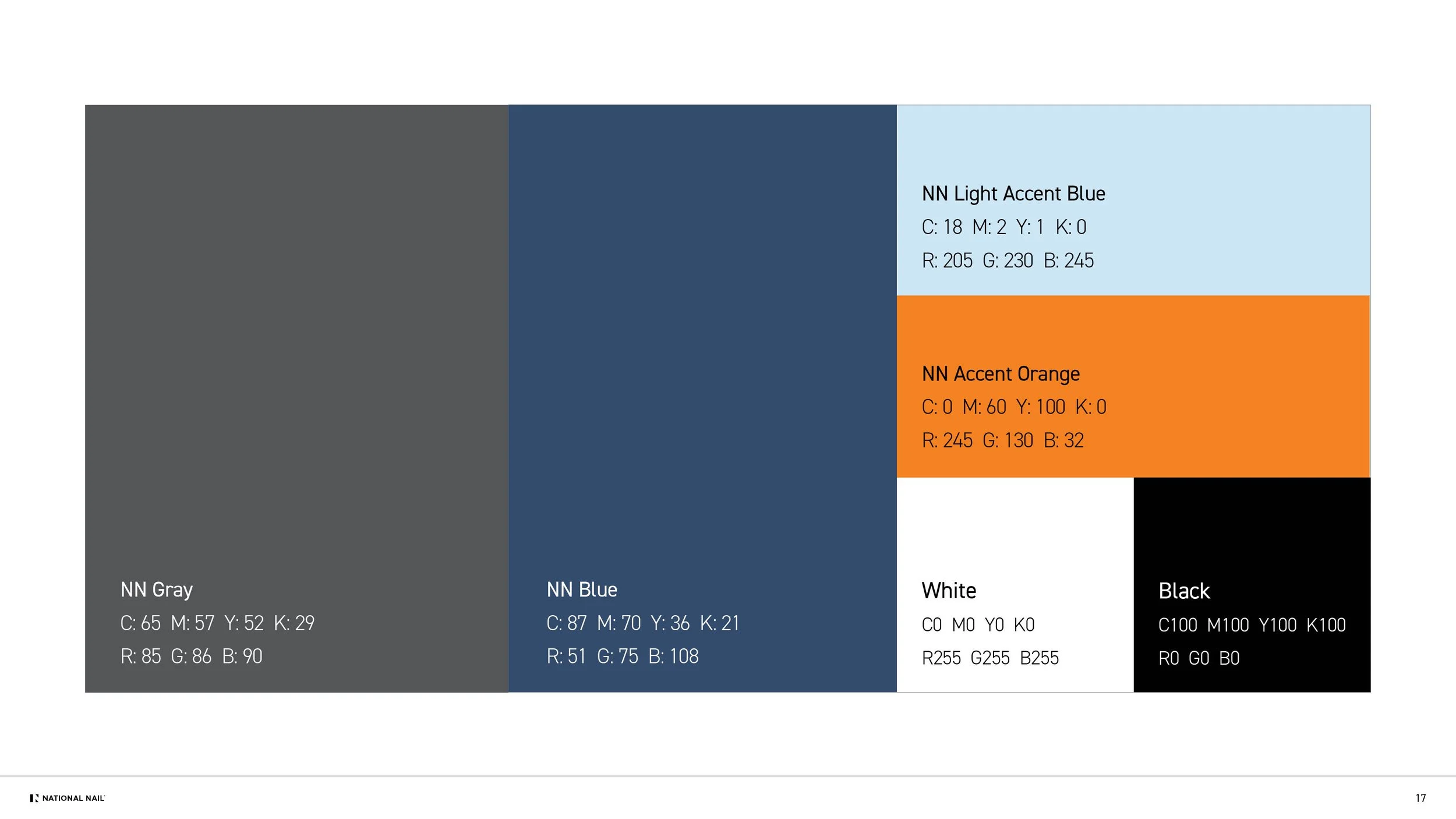
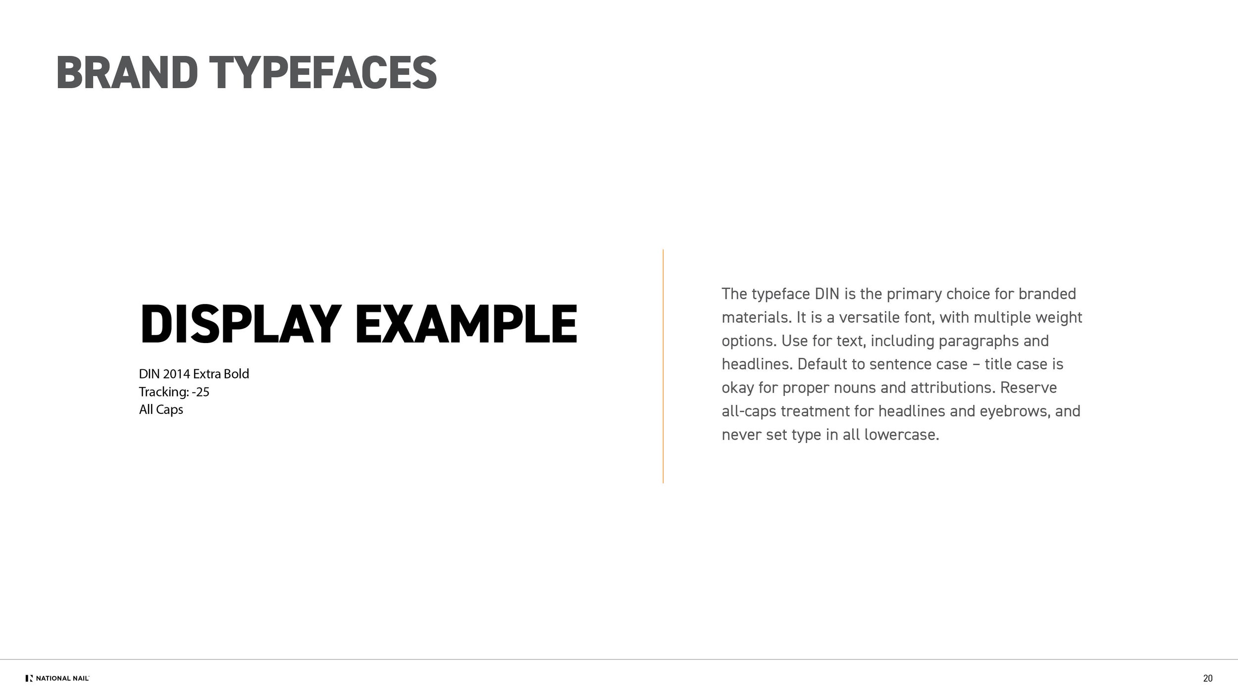
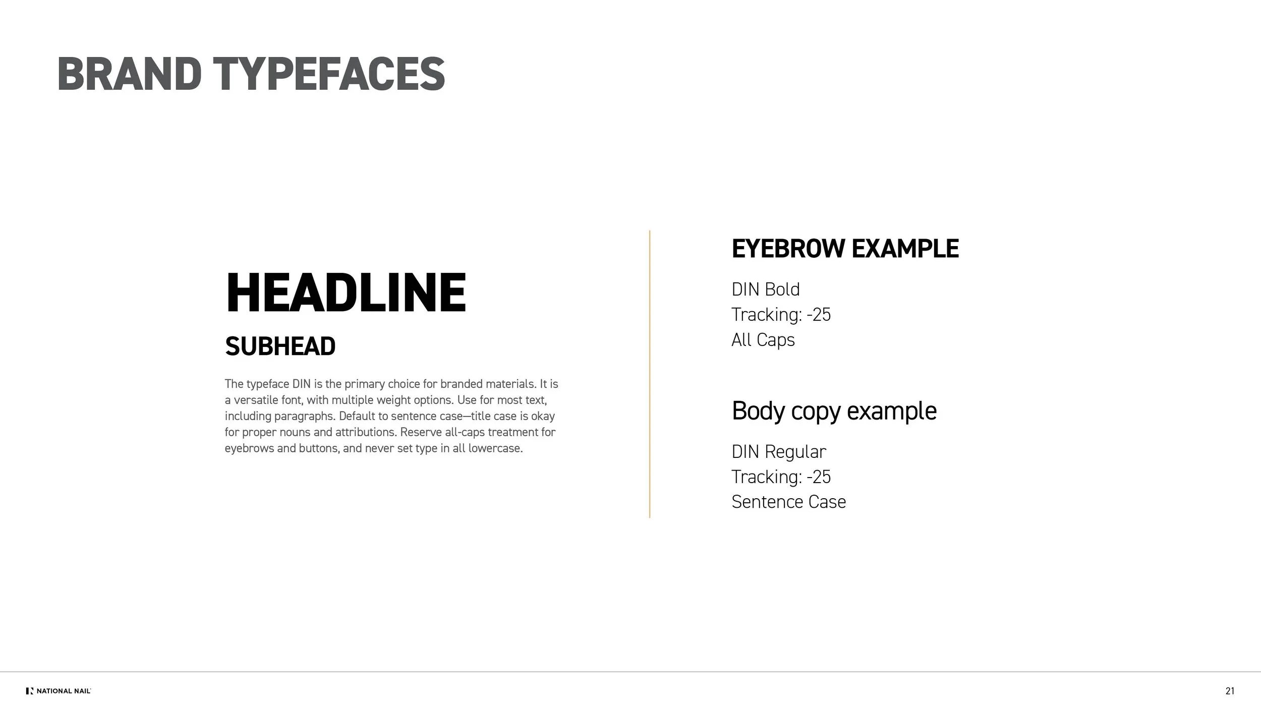
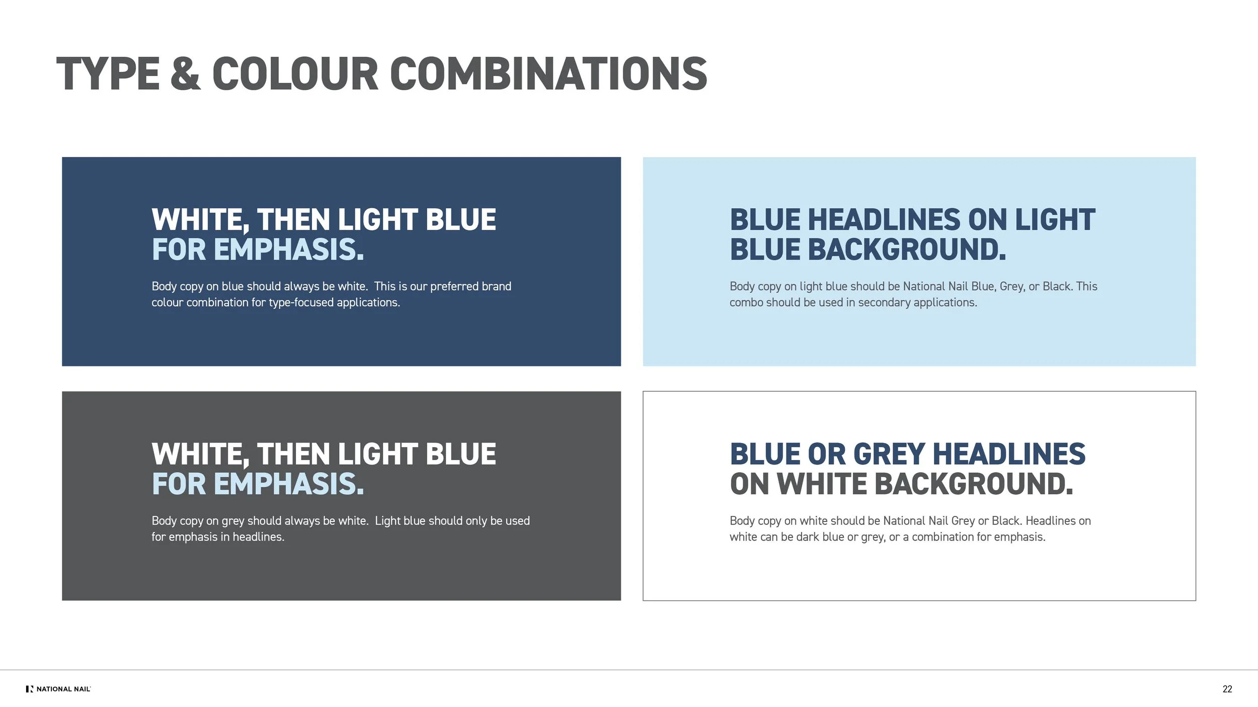
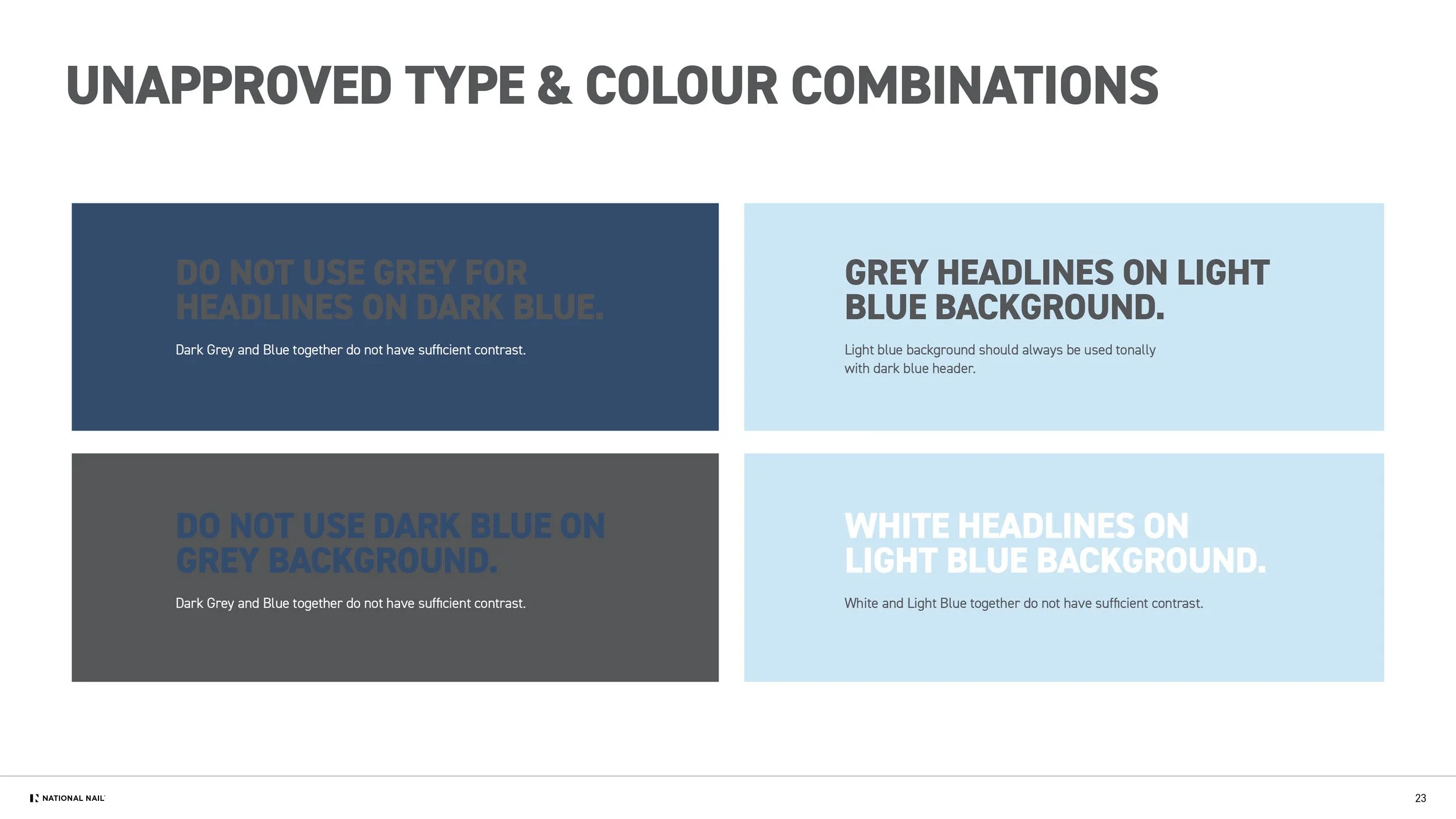
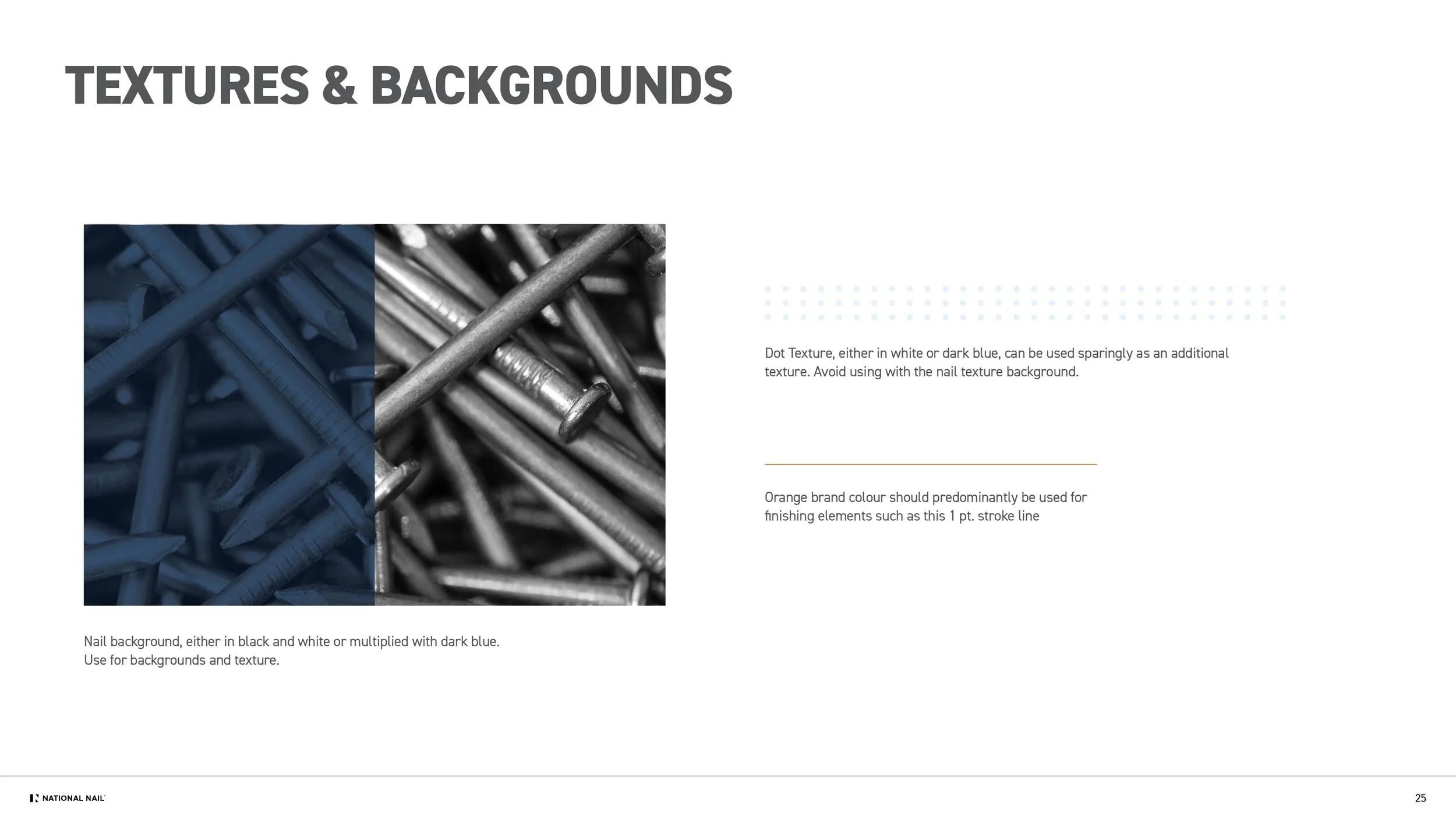
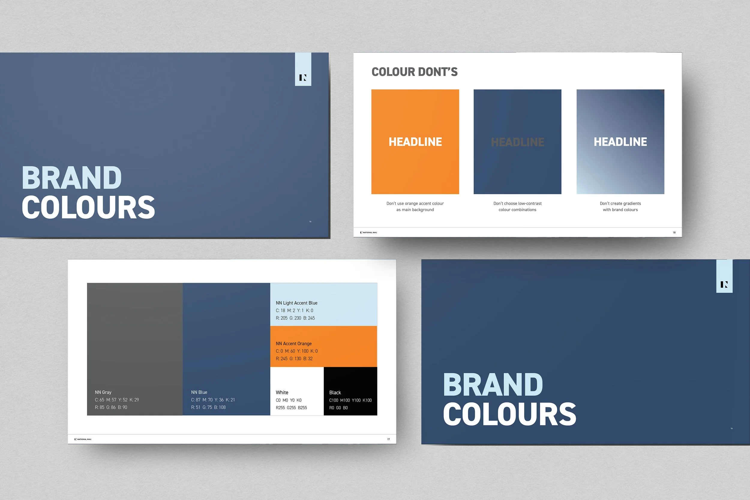
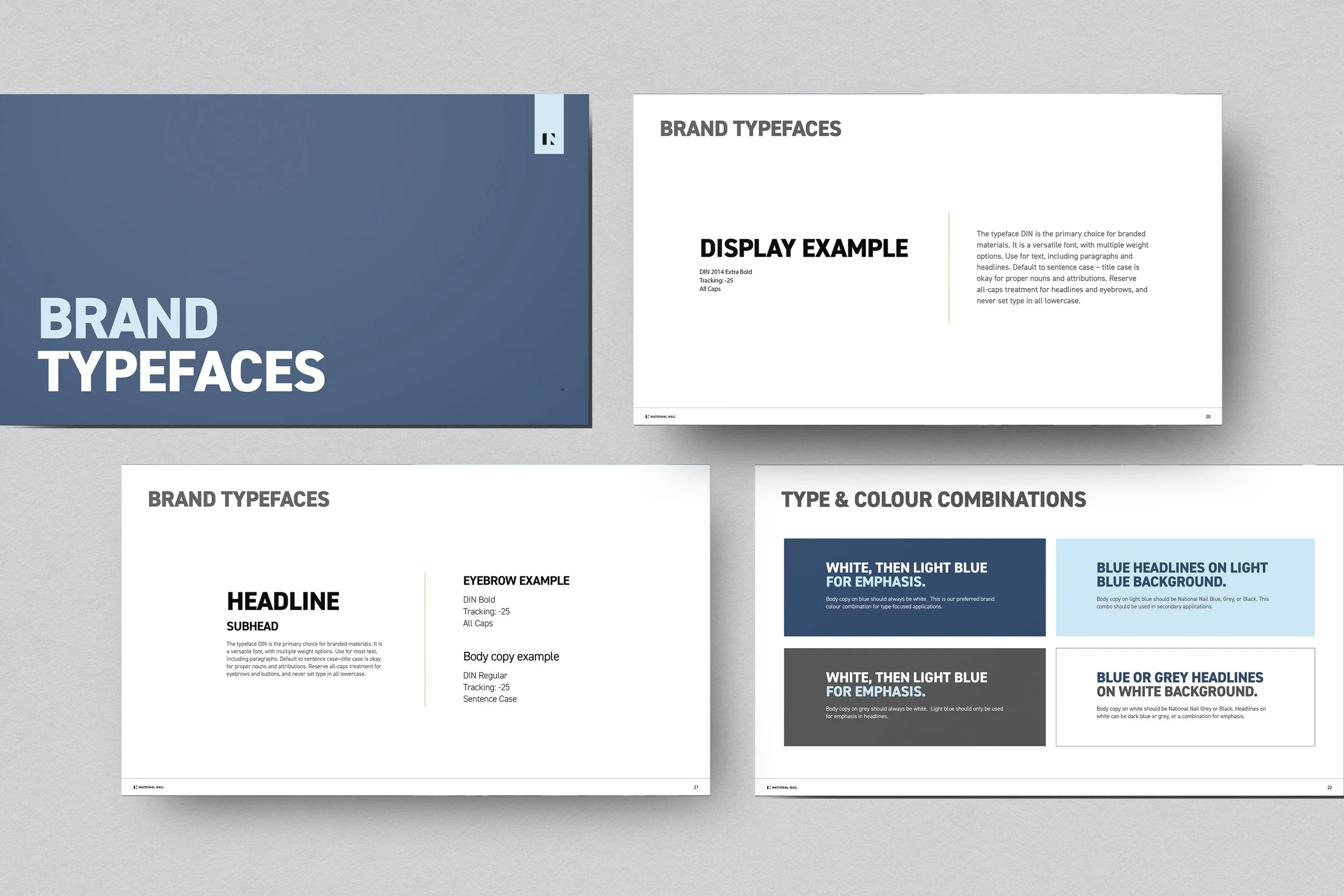
The visual system builds on a few existing elements. DIN as the primary typeface and a core charcoal grey—while introducing a more modern, confident palette. The deep blue originated from early intranet concepts, and I expanded it into a full color system with supporting hues that elevate the brand and provide flexibility across digital, print, and environmental applications.
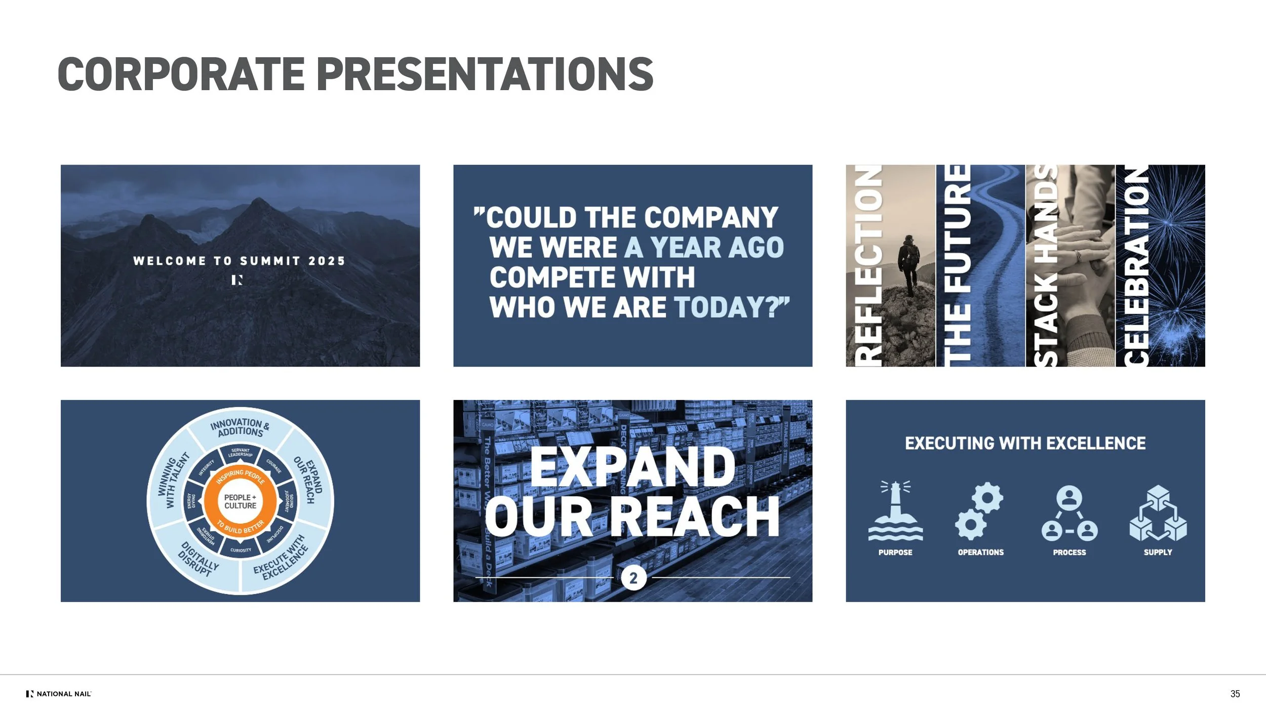
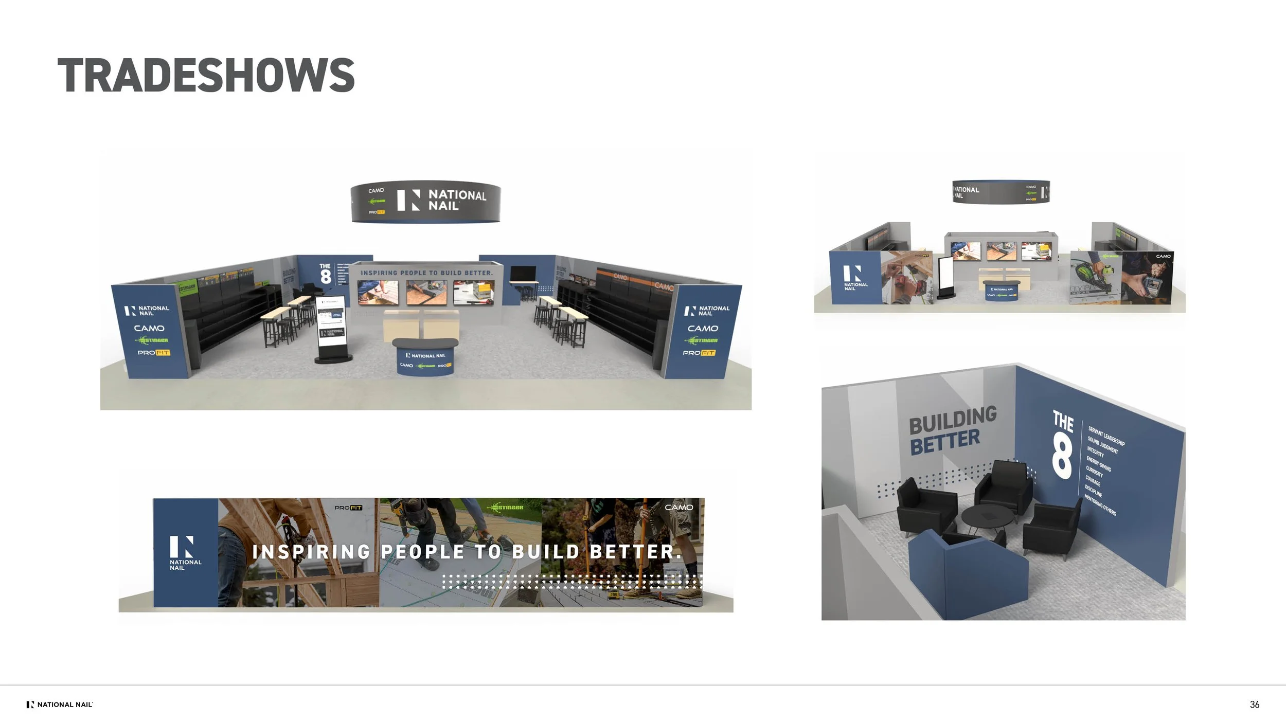
Together, these efforts created a unified, scalable brand experience that now guides communication across the organization. The full brand standards are available below.